February Art: impressions

•February 29, 2024 • Leave a Comment

On this extra leap year day February Art presents not one but two-by-two masterpieces painted side-by-side by two Impressionist pioneers. Claude Monet and Pierre-Auguste Renoir took different paths to revolution: Renoir began in trade as a porcelain painter, and compared his progress to a bobbing cork – his son the filmmaker Jean Renoir said it was more like the unerring instinct of a migrating bird. Monet’s determination and lack of parental support led him to seek out landscape artists outside the academy like Eugène Boudin and Johan Jongkind who could help him. On meeting at Charles Gleyre’s Paris studio with Alfred Sisley, Frédéric Bazille and others, the two painters quickly became friends, whose mutual influence pushed each other to experimentation.

Pierre-Auguste Renoir, La Grenouillère (1869) National Museum Stockholm

Setting up easels in 1869 at La Grenouillère, a fashionable boating and bathing spot outside Paris (full of ‘the world’s froth’ said Maupassant), they took on the challenge of recording the shape and movement of people and water, something they solved through rapid notation on white-primed canvases, tubes of paint encouraging bold even unmixed colours, exerted in visible brush strokes and kinetic energy.

Claude Monet, La Grenouillère (1869) Metropolitan Museum of Art, New York

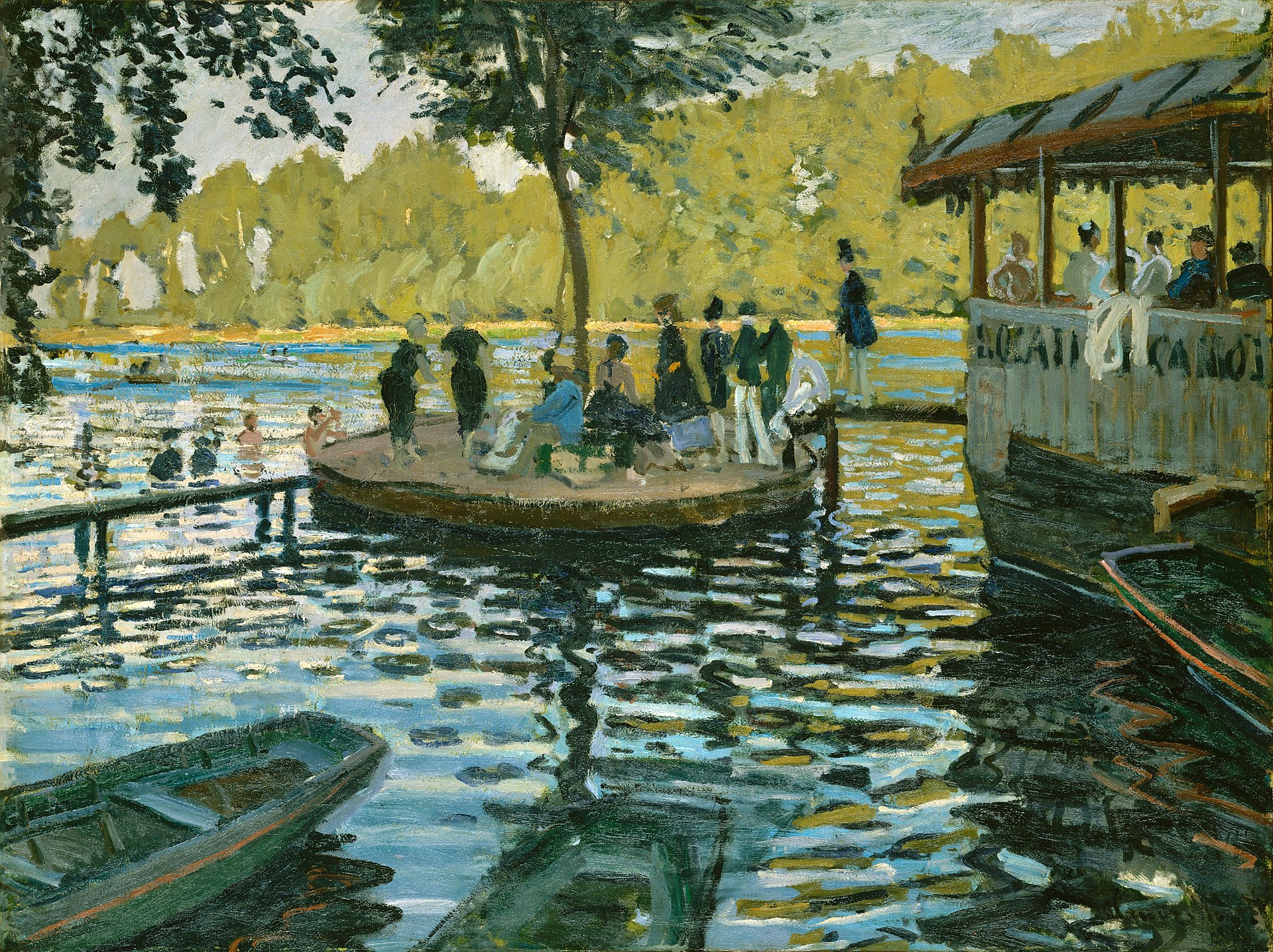
The results are so similar yet so different: Renoir drawn to details of people and their postures, sketching clusters of figures in conversation with the swift delicate marks he learnt from porcelain; Monet more interested in colour theory and patches of light, as witness the silhouetted negative space between bathers or deliberate complementary colour juxtapositions (orange and blue, red and green) in the foreground boats.

Claude Monet, Bathers at La Grenouillère (1869) National Gallery London

Whichever you like best, their experiments didn’t stop there: Renoir, in place all summer, joined his friend on more paired canvases from the same spot, looking a few degrees west for fabulous colour compositions that make you want to plunge in the water.

Pierre-Auguste Renoir, La Grenouillere (1869) Oskar Rheinhart, Winterthur Switzerland

150 years after the group’s first exhibition (called impressionist after a reviewer’s insult), nearly 155 years from that late summer at La Grenouillère, the world is still coming to terms with this sudden new way of seeing.

February Art: politics

•February 28, 2024 • Leave a Comment

There’s no way to keep politics out of art, as many examples from the foregoing month of February Art attest, even if this commentary does not focus squarely on political aspects. It won’t today, either, although this work by Jack B. Yeats for John M. Synge’s The Aran Islands (1907) is very clearly political, depicting as it does one of several evictions on Inishmaan by  bailiffs and armed Royal Irish Constabulary police of island tenants unable to pay their rent, and as a consequence left homeless, their belongings seized. Noting the strange physical types of the tall policemen and the ‘heavy rhythm of their boots’, Synge’s commentary focuses on the sullen dignity of the crowd in passive resistance against this ‘outrage of the hearth’, and the comedy of the release of some impounded pigs, knocking over three constabulary, before the inevitable accommodations and compromises reveal the whole thing as in part a staged event.

In Yeats’s picture these three are allowed a human side – it is hot day, and they sit with unbuttoned uniforms – but they must also reckon with the voice of conscience, as a young child glares at them with the force of a saint. The Irish harp on the Erin-go-Bragh mug is conspicuously just in shot, too – and this does have the immediacy of the photographs Synge was taking of the islands, from which, unlike for his illustrations to their walking tours of Wicklow and Connemara, Yeats worked. As at Elizabeth Corbett Yeats’s Cuala Press, though, these bold ink drawings were then hand coloured for this rare first edition, creating an extraordinarily vivid scene with the impact of a Japanese print or Renaissance Biblical tableau, and the humanity of Yeats’s later work in oils.

February Art: mosaic

•February 27, 2024 • Leave a Comment

What might be the best building in Europe sits modestly in the grounds of a larger church, more like red brick hut than chapel, with only neat gables, unadorned arches, and a low square tower to show anyone cared. Inside, though, all is ravishing. The Mausoleum of Galla Placidia in Ravenna was indeed sponsored in 425 AD by the Augusta, the powerful woman who ruled the Roman empire as regent, but she’s not there: none of the three sarcophaguses in the vault are hers.

It doesn’t matter, as a visitor’s attention is drawn inexorably upwards towards the marvel of an interior sky with stars, evangelists and animated saints surrounded by huddled lambs or crouching deer, doves drinking from the fountain, patterns of acanthus scroll and vines, flowers, spirals, the cross, each apse or lunette opening up new wonders.

All this made by tiles, glass blue or gold tesserae, with undimmed greens and yellows creating one of the unified masterpieces of Byzantine mosaic art – surrounded by marshes but open to the eastern seas, Ravenna was rich. The windows being screened by semi-transparent alabaster slabs, a changing half-light burns through orange and gold, fittingly in one alcove above the flames of St Vincent who is being made to burn his books.

The light, the holy fire of God, comes in less to purify than bless, bringing not austerity and asceticism, but subtlety, care, abundance, paradise, emphatically in favour of the image and the Word.

February Art: land

•February 26, 2024 • Leave a Comment

In art landscapes arrive in many ways. In fourteenth-century China they come with calligraphic poetry; in seventeenth-century Europe laden with classical architecture and myth; in nineteenth-century France they grow outdoors en plein air. They can take a single perspective, but also take us on a journey, as shapes are arranged, stories told, lands navigated. Aboriginal Australia possesses probably the oldest continuous tradition of landscape art, but it is not landscape as the west knows it. Nor is it a static tradition, but a moving one. This collaborative piece from five Pitjantjatjara Australian artists of the central desert near Kalgoorlie, Western Australia, Ned Grant, Fred Grant, Patju Presley, Lawrence Pennington, and Simon Hogan, together retells a creation story from the elders of Spinifex in new ways.

The two men or ‘Wati Kutjara’ (2019) tend to be represented by the animals they embody, the Mula Maru (Black Nosed Monitor) and Tingka (Sand Goanna), and each of five parts of the canvas tells of a location, a staging post, a moral narrative, as part of their journey through places familiar to the artists, as they interact with emus, flowers, a soaring eagle, and rain. Recently traditional materials and colours like bark and mud have been changing to linen and acrylic: this means contemporary Aboriginal Australian art is alive with new colour as well as new meaning.

February Art: landscape

•February 25, 2024 • Leave a Comment

In art history class I was told landscapes properly began with the backgrounds to paintings by the likes of Leonardo da Vinci and Giorgione, before foreground figures dropped away and trees took over in the highpoints of Claude Lorrain. Of course, depictions of the natural world on a flat plane began a long long time before, and art in landscapes millennia ago. But even a landskip in the Dutch sense, a topographical representation on a flat plane implying a viewpoint and depth, began well before Western art cottoned on: in China. Wintry landscapes on fan-shaped paper were a cliché by the tenth century, while large-scale wide-view or vertical long view forms are attested by the eleventh, and some say much earlier. This latter genre draws the eye from an entry point at the bottom of a hanging scroll upwards towards more distant features, as in this work by Ni Zan, The Woods and Valleys of Mount Yu (1372), executed towards the end of his life, by which time he was a refugee and supposed recluse.

Beyond the red seals, colour is not required, as the dry brush and ink technique records a lifetime of close observation in a typical group of friendly nearby trees and enticing distant hills. The accompanying poem rather celebrates the artist’s life as a companionable wanderer, self-consciously inscribing a sophisticated tradition of observation, feeling, and memory: ‘We watch the clouds and daub with our brushes / We drink wine and write poems. / The joyous feelings of this day / Will linger long after we have parted’.

February Art: moon

•February 24, 2024 • Leave a Comment

For tonight’s full moon a harvest festival is brought to life in moonlight. The artist, Edward Calvert, is associated with William Blake, Samuel Palmer and the ancients, and the group’s unorthodox Christianity is on view in this woodcut with the perhaps surprising epigraph ‘By the gift of God in Christ’. The print’s title, ‘The Cyder Feast’ tells rather of pagan exultation.

The Cyder Feast 1828 Edward Calvert (1799-1883)

Carved not long after Keats penned ‘To Autumn’, this minute but sensuous depiction of English country life hints at a comparably decadent abundance, though where Keats has a languorous Autumn by a cyder press watching ‘the last oozings hours by hours’, for some here the work is still going on as apples are brought to be pressed by an oxen. Yet the spilled baskets and the paired gestures of the front couple suggests a freer partaking of the product, flinging them towards Dionysian revelry as groups unreel and dance by the light of the moon. Calvert’s intricate engraving technique borrows from Blake, and manages like Palmer’s ink and gum drawings to let sheer texture create extraordinary contrasts, as between the gnarled bark and the round purity of the moon (perhaps hinting at a political sensibility to such licence). It is hard to believe such colour and energy can be wrought from so little: just three-by-five inches of black and white.

February Art: Japan

•February 23, 2024 • Leave a Comment

Today in Japan it is the emperor’s official birthday, but being a bit wary of emperors February Art pays a refracted tribute instead. The textiles and customs of Japan were all the rage in the Japonisme of Paris and London, and for artists like Whistler and the Impressionists it was the bold forms of woodblock prints that had the most effect. In Antwerp Van Gogh started buying cheap Japanese prints to decorate his flat, but it was only when he moved to Paris and studied them closely that their influence can be felt, and their obsessive collector discovered ‘Japanese art is like the primitives, like the Greeks, like our old Dutchmen […] it doesn’t end’.

Three amongst his collection he copied into oils, including this 1887 study of a dramatically silhouetted tree borrowed from Utagawa Hiroshige’s ‘Flowering Plum Orchard’ (1857). Drawing and painting is all about representation on a flat surface – one answer to the obvious distortion of reality is to accept it, making the artist simply the arranger of shapes. Doing so allowed Japanese woodblock artists to become masters of composition, hiding horizons, cutting objects off at the edges, arranging bands of colour to burst out of the image, and writing to break the frame.

For his adaptation Van Gogh employed even brighter hues, rounding the background figures to give them life, unscrupulously borrowing from another print a framing device of orange and black characters. Such appropriation of Japanese art allowed him to see the world and picture-plane anew, and when he moved to the south of France this would find revolutionary apotheosis: ‘After some time your vision changes, you see with a more Japanese eye, you feel colour differently’.

February Art: play

•February 22, 2024 • Leave a Comment

It’s been a while since February Art played with colour: who better to join the game than Paul Klee, with his fantastically-titled ‘Battle Scene from the Comic-fantastic Opera “The Seafarer”’ (1923). During the Italian Renaissance there was a supposed dividing line between Giorgione and Titian and the Venetian colourists, and Florentine masters of line like Leonardo and Michelangelo: the art of painting vs the art of drawing. It was never entirely true even then, but with Klee you certainly get both, and more. As a teacher at the Bauhaus, Klee was a colour theorist who started from the first principles of line, shape, and dimension; as an artist he at different times talked about taking a line for a walk and improvising freely on a keyboard of colours.

The musical flavour of this is elaborated as one of his wonderfully irregular gradated tonal grids becomes the sea-scene for some quixotic sea-knight, who might over-balance prodding these toothy monsters were it not for the lovely red transparency of his impossible spear. Here, maybe, colour is musical and the line is literary, but this messing with the picture plane flattens them into one joyous synaesthesia, in an affectionate take on grand Wagnerian opera or solemn symboliste poem. There’s no such opera, but who says there couldn’t have been? (And Ezra Pound banging timpani in the recording of his Anglo-Saxon ‘The Seafarer’ translation is just as wonderfully quixotic). Klee is always fun, but his games quite seriously prefigure the most meditative twentieth-century abstractions (Miró, Rothko) or the postmodern shadow-play of Jorge Luis Borges.

February Art: hell

•February 21, 2024 • Leave a Comment

The doors of Hell and Chancery are always open, they say. But Rodin’s Gates of Hell (1880-1917) don’t open – well, physically they can’t. But they do open the future of sculpture: his, and everybody’s. Because everybody conceivable is here somewhere, lamenting tumbling thinking peering falling flirting kneeling declining loving running reclining coupling supporting berating despairing.

Originally a commission, they were planned as a dark mirror to Lorenzo Ghiberti’s Gates of Paradise at the St John Baptistry in Florence. When the project didn’t come off, Rodin kept the huge clay model with him, sporadically adding and altering the figures which surround and plague a brooding Dante (also recognisable as Rodin’s sit-alone sculpture The Thinker).

In this way these doors are Rodin’s Ur-source, origin text, the spawning-ground or resource for most of his other sculptures, becoming in the process impassable, impossible – confusingly they also exist in several places and versions cast in bronze or plaster. L’enfer, c’est les autres, said Sartre, meaning in part how others see us; wherever and however we look at these gates, hell is us.

February Art: selfie

•February 20, 2024 • Leave a Comment

Rembrandt is justly best known for his paintings; not least his later portraits, including self-portraits with his bulbous features daubed unsparingly in thick oil impasto. This exquisite early selfie (1630!), made presumably for his own amusement, shows a lighter side to his self-obsession. Because he was also, I think, the finest etcher in history, conjuring meticulous cross-hatched interiors, character studies, and brooding Biblical scenes out of the unpromising materials of metal and acid, something I discovered in an overwhelming basement exhibition at the Albertina in Vienna.

Rembrandt makes etching look easy: most people require preparatory drawings but (as here) he often drew directly onto a copper plate covered with mix of resin and beeswax, using a needle to scratch until the copper showed through. An acid bath then etches the lines onto the plate which can afterwards be inked and passed through a press to put the drawing on paper. The process can be repeated and the plate reworked, generally to add darkness or complexity, each time producing the image in a new ‘state’. In expert hands the first state especially can be light, quick, joyous: there’s a kind of magic in ravelling soft flesh out of such thin lines, a face caught through a blizzard of hair peering quizzically, in mock-alarm, at himself – a self reversed of course in the mirror, but then also printed in reverse, so himself, no other, wondering at us maybe, who in return wonder back (though we should know, we’ve been told) how on earth it is done.

February art: Saint Sebastian

•February 19, 2024 • Leave a Comment

From arrow-pierced lions to arrow-pierced men – well, one man, many times, Saint Sebastian, a suffering nearly-nude figure allotted a sexual frisson Christ’s passion generally has not: martyrdom can be hot. For his initial iconography the saint appears closer to the grizzled Roman soldier he was, but increasingly his body was depicted as youthful, stripped, tied up, pierced; hardly surprising he became a gay icon. In Guido Reni’s pictures his loin cloth seems about to slip off, while Botticelli’s figure stares at us with the smouldering gaze of Seb the centrefold. So tall in El Greco’s cut up canvas he almost grows out of the painting, for De La Tour he is carried prone but lit up red-hot, while with his back to us Keith Vaughan’s group of stylised figures recalls a gym scene.

Vaughan, John Keith; The Martyrdom of Saint Sebastian; Bradford Museums and Galleries

Glyn Warren Philpot’s take on the subject is more elusive and (for him at least) more experimental, as late in life he turned from sober society portraits under the influence of Catholicsm. Kept privately and sold way beyond its estimate, it does not lack in desire; before his death in 1937 Philpot became obsessed with male figures of acrobats and models, painting repeatedly and intimately a black model and companion Henry Thomas, and this model, Karl Heinz-Müller.

Here beneath St Sebastian’s glowing halo his face is turned in shadow, one hand reaching out to touch himself, the other (displaying the model’s severed fingers) falling towards the white lily of resurrection. Actually St Sebastian didn’t die by arrow wounds – he was rescued, apparently by St Irene; in this cropped composition the intensity wants no rescue, the transport almost ecstatic.

February Art: lions

•February 18, 2024 • Leave a Comment

Power corrupts; but it can also command great art, mostly (not always entirely) aligned with its corrupted values.

These carvings from were exhumed in Nineveh, from the Assyrian palace of King Ashburnipal (c.645 BC), a place of gardens and cuneiform libraries but also authoritarian government, their shallow reliefs showing up close the king himself by sword and arrows hunting lions, whose bodies retch or contort in suffering, paws gripping the earth.

Several things here are not quite as they seem. First, other sources suggest that the lions’ threat was no longer existential, indeed like swans and the Queen of England (I’m a bit vague on this) only the reigning monarch or their representatives were allowed to kill them.

Second, in line with this, the carvings clearly show that the smaller Mesopotamian lions are let out from cages for the occasion. Third, in my favourite panel the beautiful individualized foliage behind the lying lioness was probably planted – some scholars think it was Nineveh that had the hanging gardens, not Babylon, where no evidence survives.

In other words, all these scenes are theatre, depicting a ritualized, symbolic act of power and protection, deliberately bringing together (as worthy opponents) lions with royalty (an association that survives), civilization against nature, the king as personal defender of values – in one carving Ashburnipal carries a writing tool in his belt. The lions feel it just the same; it is impossible to know if the naked intimacy with which the carver shows their dying hinted at other kinds of suffering, slavery, and matrydom. But by showing through such visceral details that civilization comes with violence, these images are more honest than some; by describing the nature of power, they have real modern resonance, and not just because they were found across the river Tigris from the modern city of Mosul, decimated during the Iraq war.   

February Art: hope

•February 17, 2024 • Leave a Comment

Today is a black day. The death of Alexei Navalny, killed by the Russian state, marks the latest chapter in the rise of authoritarian neo-fascism not only in Russia but across the western world: the second greatest threat to humanity after environmental destruction, though given its reliance on coal and petrochemicals these forces combine. I thought to mark it with Kasimir Malevich’s iconic, nihilistic Black Square, but what such a negative movement hates most is transparency, light, life so instead February Art turns to another artist persecuted by Russia, Marc Chagall, and his L’arbre de vie (Tree of Life 1976) from the Chapel des Cordeliers, Sarrebourg, France.

Born Moishe Shagal in Vitebsk in what is now Belarus, as an émigré Jewish artist Chagall’s work draws on memories of home, playing variations on a series of recurring homely motifs: lovers, animals, mothers, musicians, dreamers, all of whom people this panel, though in biblical guise: David playing the harp, Isiah with angels, Jesus entering into Jerusalem (bottom left) and a couple so joyful they surely represent more than Adam and Eve.

‘When Matisse dies Chagall will be the only painter left who understands what colour really is’ said Picasso, and in his later glassworks Chagall’s ability to paint with light extends such subtle pantheisms into political meaning, commemorating (as did Barbara Hepworth) Dag Hammerskjöld for the United Nations in windows flooded with hope.

The most human of modernists, Chagall, decided André Malraux, has ‘looked at the world with the light of freedom, and seen it with the colours of love’.

February Art: the sea, the sea

•February 16, 2024 • Leave a Comment

A very different representation – rather evocation –of the sea today. I knew about the cries of joy and relief from Greek soldiers ‘Thalatta! Thalatta!’ when as Xenophon describes it they crested a mountain and glimpsed the sea and safety, but Pelagos’ (1946) is also Greek for sea, uttered here much more quietly.

Pelagos 1946 Dame Barbara Hepworth (1903-1975)

In an early BBC film Barbara Hepworth talks of her attachment to closed forms, returning circularly around themselves, as suggesting some kind of bond, maybe between mother and child, or between man and nature. Unlike Brancusi’s polished ovoids, the hollowness, openness, and variability of the form as we move around it does hint at some kind of access. So, made of elm wood by the sea at St Ives this seaside shape suggests to some a shell, to others maybe some kind of ancient lyre. Hepworth speaks eloquently of her difficulty of putting sculpture into words, partly because it appeals to some of our earliest apprehended senses like touch and even hearing, both available in the womb long before sight; probably the tension and release of sea-rhythms or wider music is played with as these strings are held taut by a curved painted spiral. Normally I would hesitate to suggest a political register for such a piece, but this is environmental art avant la lettre – and because of its post-war date, maybe the rhythms and balance of Pelagos, like the soldiers’ relieved cries, hint at peace’s prospect and some return to harmony.

February Art: love

•February 14, 2024 • Leave a Comment

For this Saint Valentine’s Day (also Ash Wednesday, but see yesterday’s Giotto led penitence), February Art celebrates love – but not the uncomplicated holding-hands type. No, Bronzino’s Allegory with Venus and Cupid (1545) is after something wilder and weirder. Scholars agree this is an allegory, but can’t agree of what.

One face screams in pain, another is brainlessly mask-like, and while Vasari ascribes these to Jealousy and Fraud, what to make of what he calls Play, or Pleasure, could one of these be the demure face on reptilian body? Is the figure of Time pulling back the curtain, or about to cover the unreckoning (but immortal?) incestuous lovers? Moreover X-rays suggest their contortions were still in the making as the canvas was painted –before she held the arrow, originally Venus’ right hand tousled the adolescent Cupid’s hair, to match his licentious grasp of her. As some moral allegory against the sin of love in time of syphilis, this all seems too enticingly frank to be wholly convincing, and the laurels that could otherwise celebrate the power of poetry seem wilfully hidden, mouths devoted to other pleasures. Neither love nor understanding comes easy in this extraordinary canvas, enamel-like in its elegance and polish. I’ve spent a long time in front of it at the National Gallery in London, and I don’t know what it means, either – perhaps that was part of the fun for its first viewers. But whatever is being said joins us to something subversive, the whole picture plane (as in Bronzino’s adjoining Madonna and Child) pushed forward, up close, as it were full frontal, the figures, anguished or jesting or lustful, thrust out into a playful, painful world of agony and love.